
DevExpress Prism Sample
Chart Types and Live Previews
The report page, chart-type picker and chart-graphics settings each have a visible help icon. The picker/settings icons open this online guide in a viewer owned by the invoking window, so it stays accessible above modal chart dialogs. Local documentation is the fallback, not the default.
Open Chart type... from the report toolbar, the graphics window, or a main/backup dashboard chart's configuration. The picker uses the actual DevExpress Dashboard renderer. The installed build exposes 29 choices: the complete simple bar/line/point/area series enum, both range types, weighted bubble, high-low-close/stock/candlestick, pie/donut, numeric XY scatter/bubble, and horizontal bar variants. These are Dashboard chart choices, not unsupported 3D types from the separate WPF Charts library.
Select a type to redraw the preview using the current chart's in-memory data; changing the preview does not query SQL or alter saved settings. Default uses the genuine DevExpress theme palette without an injected color scheme. Office and Pastel use DevExpress's predefined palettes. Custom uses the chart palette. DevExpress default styling keeps native models; turn it off for custom artwork on supported vertical and horizontal bars. Regular lines, areas, points, pies and financial charts remain native. Changing palette or style updates the preview live.
The field selectors map real columns to each required role. Simple types and pie/donut need an argument and a value. Optional Secondary and Series fields provide multiple measures or grouped series for stacked/comparison charts. Range types require distinct Low and High columns; bubble requires Value and Weight; numeric scatter requires X and Y, with Weight for XY bubble. Financial types require High/Low/Close, plus Open for candlestick and OHLC. Financial arguments must be unique so the picker does not invent first/last price aggregation. Open/Close must lie within Low/High. Negative pie values and negative bubble weights are rejected rather than silently omitted.
When the current data cannot support a type, the preview is explicitly marked Example data, names the missing/invalid requirement, and disables Apply. That example demonstrates the chart, not values collected from the server. No fake ranges, prices or weights are saved. A single server-count column cannot truthfully become a financial chart. Map suitable real columns to enable Apply.
Apply saves the type, native/custom appearance, palette and field mapping per chart. When opened inside the graphics window it returns a draft; Apply on that parent window commits it, and cancelling the parent discards it. Cancel discards the draft. Main and backup dashboards opt into a real native Dashboard renderer when a native type is selected; untouched saved charts retain their previous renderer and appearance. New-chart defaults include the chosen type and styling, but do not copy another chart's column mappings. Existing legacy animation/line/break controls are hidden for native charts. The picker has its own help link, owned by the picker window.
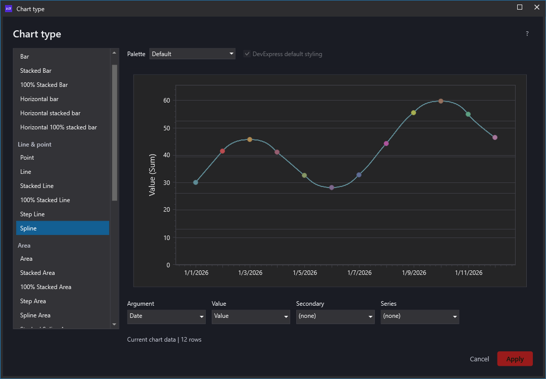
Verification: --harness-chart-types exercises every advertised type, standard palettes, custom-bar opt-in, missing-field examples, Apply/Cancel, and the main widget/persistence path. Results are in %TEMP%/MinionChartTypes.txt; screenshots under %TEMP%/MinionChartTypes use explicitly generated test data. The preview host keeps the viewer alive while switching types so asynchronous SDK refreshes are not invalidated by a null dashboard.
SDK references: Dashboard simple series, Dashboard series families, WPF native palettes.
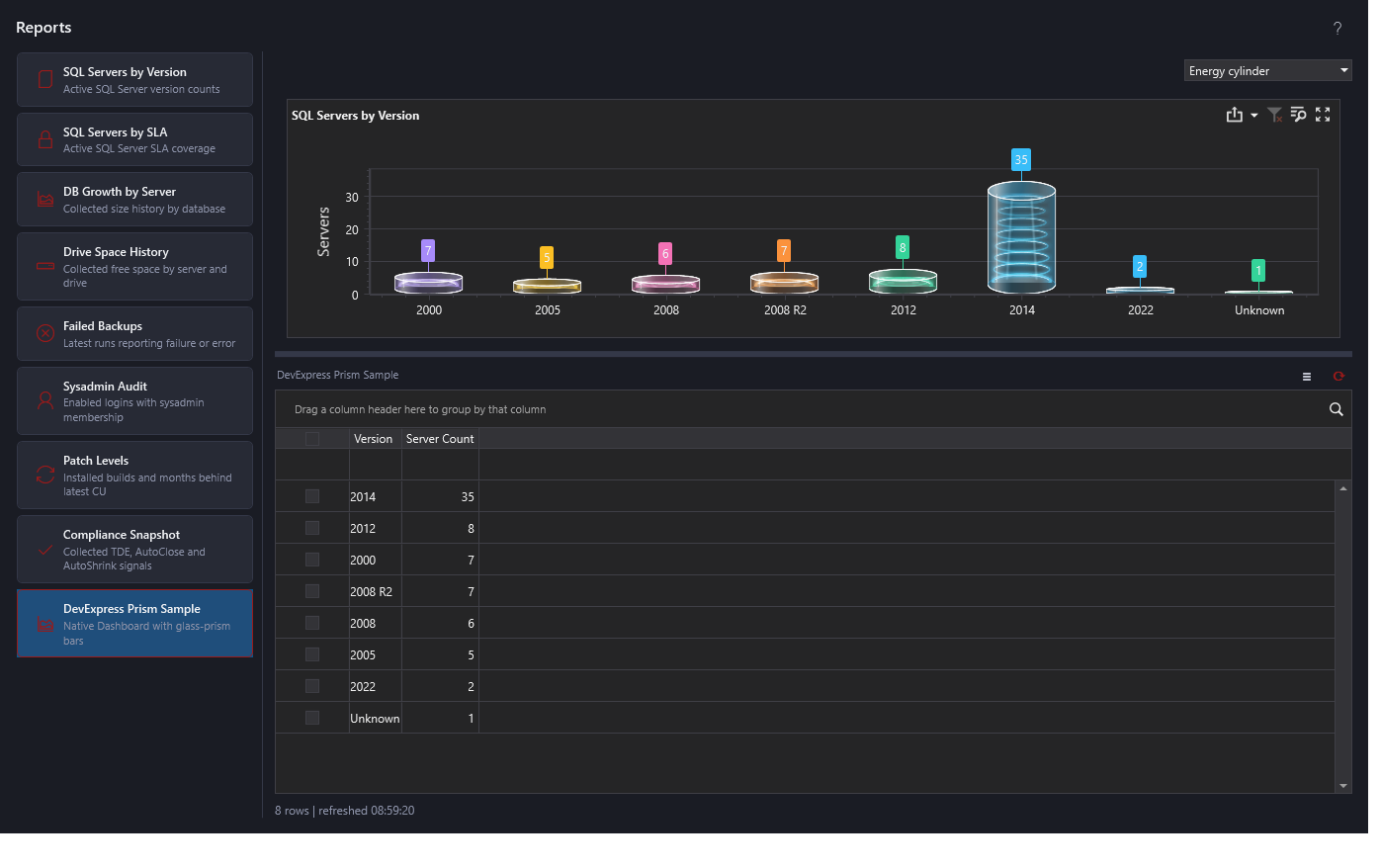
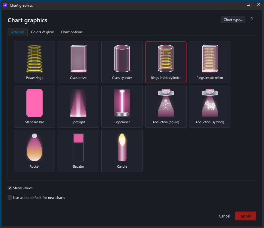
The saved graphics picker and the main dashboard now share one artwork catalog: Power rings, Glass prism, Glass cylinder (plain), Rings inside cylinder, Rings inside prism, Standard bar, Spotlight, Lightsaber, Abduction (figure), Abduction (symbol), Rocket, Elevator, and Candle. The native sample's quick dropdown provides the same choices. Gallery thumbnails use the same drawing routines as the charts, not substitute illustrations.
Choose DevExpress Prism Sample at the bottom of Reports for the isolated artwork demonstration. The other eight reports now also use native interactive Dashboards with linked details and history filtering. See Reports options and calculations.
The bars use DevExpress's CustomBar2DModel and shared drawing routines. Rings inside prism clips the ring stack and glow to the glass front pane's interior and paints the glass on top, preserving the outer edges and faces. Both cylinder styles have straight upright walls, curved glass shading, and flattened elliptical end caps. Glass cylinder has no rings; Rings inside cylinder contains them. Very short bars may not have room for visible internal details.
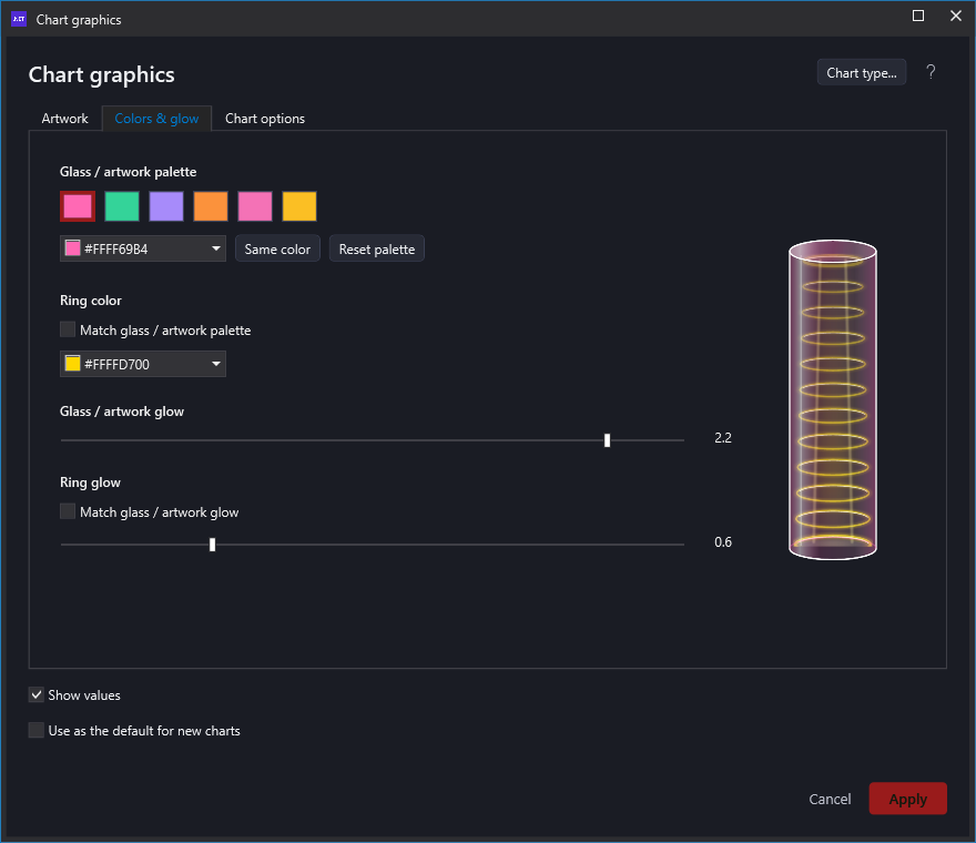
The quick style dropdown changes the current view only. For a saved preference, open the Chart graphics gear. Artwork contains the shared visual gallery. Colors & glow edits palette swatches, independent ring color and independent ring glow with a live preview. Chart options contains legend, category-label direction and the native bar-width/grid-line/axis-title controls. Value labels and the new-chart-default checkbox stay beside Apply/Cancel.
Colors and glow are linked by default for backward compatibility. Clear Match glass / artwork palette to use a separate ring tint, for example cyan glass with gold rings. Clear Match glass / artwork glow to keep dim glass rims while the rings glow more strongly. Relinking restores the palette/glow relationship without changing palette entries. Ring color affects ring artwork only, not chart heights, axes, label values or the native body-color legend. Same color sets the whole body palette to the selected swatch; Reset palette restores the original vivid colors. Glow is decorative intensity, not a data multiplier; bar width changes spacing, not bar values.
Apply saves this chart's choices in the existing UserConfig.json and updates the current view. Cancel discards the draft, including color edits. Use as the default for new charts saves the complete graphics preference, including ring links/overrides, without overwriting previously saved per-chart choices. Dashboard widgets retain their existing layout/configuration persistence. Main-dashboard chart configuration windows offer Chart graphics... with the same complete catalog, colors, glow, labels, legend and label direction; their existing chart-type, animation, line, scale-break and other controls remain available. Native-only bar spacing/axis switches are not shown for the other renderer. Backup dashboard chart configuration uses the same saved fields as the main dashboard.
Changing appearance does not rerun the SQL query or replace its result table. Native filtering remains available, and selected filters are retained when applying graphics. The chosen style is preserved across theme changes and restored when reopening this report.
DevExpress owns bar sizing, axes, values, point selection, tooltips and dashboard commands. All four visuals are DPI-aware; none is a LiveCharts control or a screenshot of an entire chart. Ring stacks are decorative, not discrete units: read server counts from the native labels and tooltips, not by counting rings.
Hover a bar for its SQL version and server count. Native chart commands provide selection, reset, maximize, data inspection and export. The tested native image export retains the values and palette but renders ordinary flat bars, not the custom artwork. Custom styles are currently on-screen only; this sample does not claim identical print/export rendering.
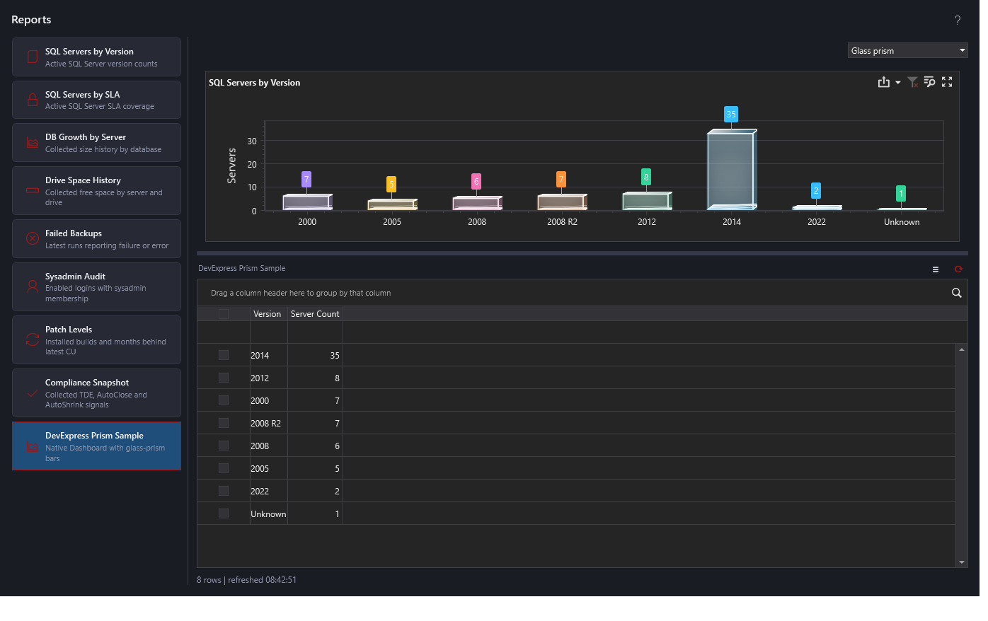
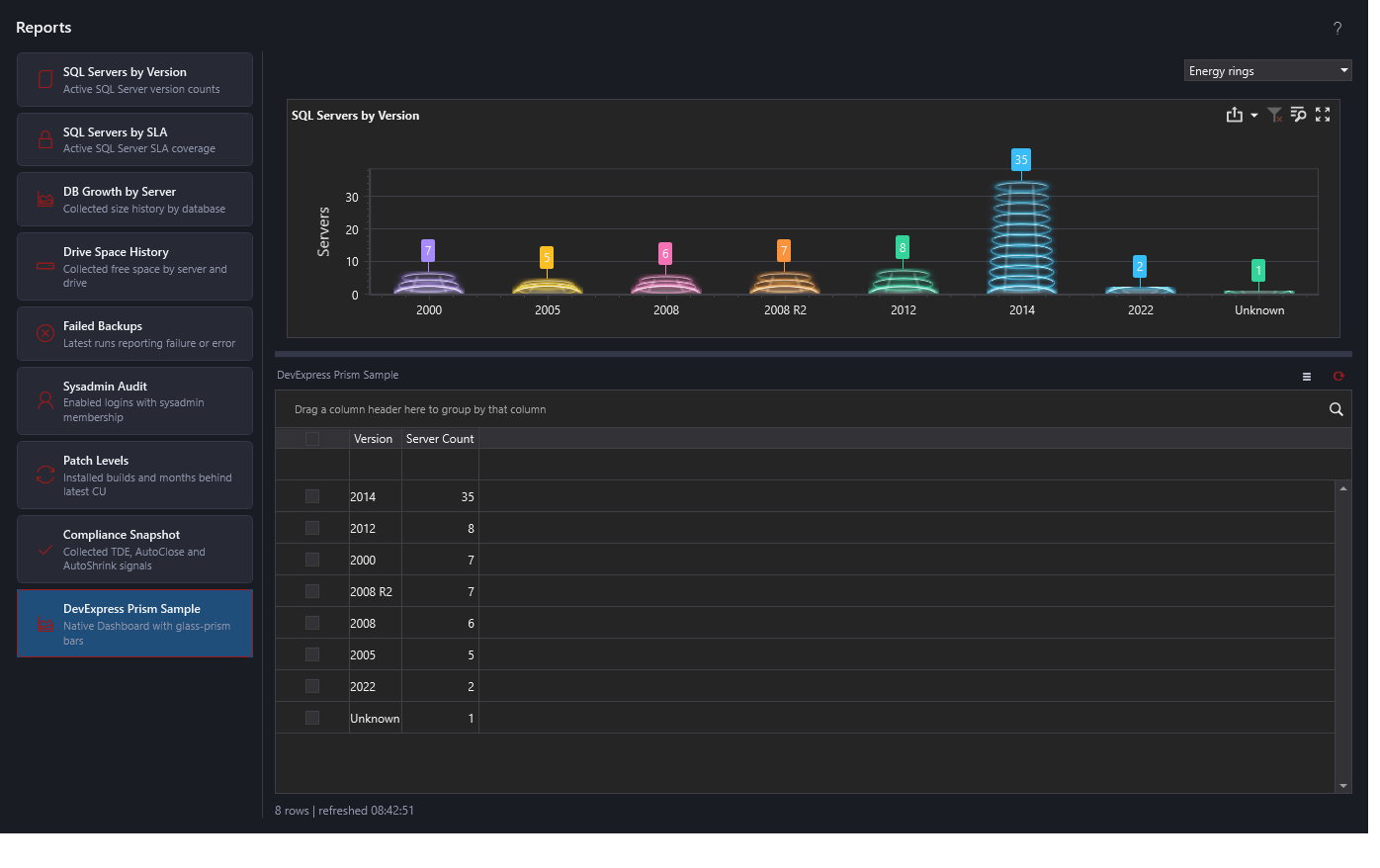
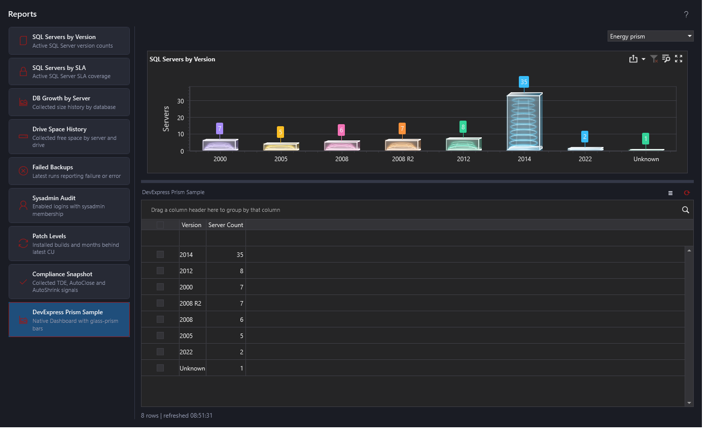
This sample remains separate from the production version dashboard. It creates no new collection or repository writes. Appearance settings contain only graphics preferences; report rows remain in process memory. Validation: MinionEnterprise.exe --harness-prism-dashboard writes %TEMP%/MinionPrismDashboard.txt and dark/light/compact images under %TEMP%/MinionPrismDashboard, including settings Apply/Cancel, persistence, defaults and shared-renderer checks. The harness restores the graphics configuration section after testing.
Implementation references: DevExpress 24.1 custom series models, WPF Dashboard customization.
Documentation revision: A6D33DC2DAD531EC